
Home › Resources › Checklists › Product Page Optimization
Product Page Optimization Checklist
The product page is the only template where the decision to buy is actually made, and on most stores it is the template that has been changed least. Forty-two checks that cover both halves of the job: whether the page answers the questions a shopper has, and whether it can be found by the people asking them.
CHECKS
42 checks
TIME TO RUN
Half a day
LAST UPDATED
September 2026
LEVEL
Store owner or marketer
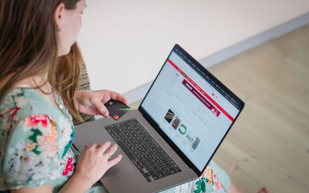
Every other page on a store exists to deliver somebody to this one.
- Before you start
What this covers, and how it differs from the CRO checklist
Two checklists touch the product page. They are not the same job, and running the wrong one wastes a day.

This checklist goes deep on one template. It covers the buying decision, the imagery, the copy, the variant and stock behaviour, the reviews, and how the page performs in search — because on a product page those are the same problem seen from two sides. A page that fails to answer an objection also fails to contain the words people search with.
The eCommerce CRO checklist does something different: it walks the whole journey from product page to basket to checkout to confirmation, looking for where the journey breaks. If your problem is that people add to basket and then vanish, that is the checklist you want.
- Analytics for your top twenty products by revenue
- Your own store open on a phone, not a desktop emulator
- Search Console query data for at least one product URL
- The last twenty customer service messages about products
Run it against your five highest-revenue products first. Findings on those pay for the time; findings on the long tail rarely do.
SECTION 01
7 checks
The buying decision above the fold
Most shoppers decide whether to keep reading in the first screen. This section is about whether that screen contains the four things a purchase decision needs: what it is, what it costs, when it arrives, and what happens if it is wrong.
Confirm the product name on the page matches what customers call it
Internal names, SKU codes and supplier titles all fail the same test: nobody searches for them and nobody recognises them. The name is the first thing that confirms the shopper is in the right place.
Check the price is visible without scrolling on a phone
A price that sits below the fold on mobile forces a scroll before the most basic question is answered. Check this on a real device, at the smallest screen size in your analytics.
State the delivery cost and date before the basket, not after it
Unexpected delivery cost is the most common reason given for abandoning a basket. Putting the number on the product page loses you the orders you were going to lose anyway, earlier and more cheaply.
Put the returns terms within sight of the buy button
Returns policy is an objection, not a legal page. It belongs next to the decision it affects. One line and a link is enough.
Make the add-to-basket action unmistakable on a small screen
It should be the highest-contrast element in view, large enough to hit with a thumb, and not competing with a wishlist or share control of equal weight.
Check what happens immediately after add-to-basket
A silent add, a full page reload, or a modal that hides the basket all break the flow. The shopper needs confirmation and an obvious way to continue or check out.
Remove anything above the fold that is not helping the decision
Announcement bars, cookie banners that persist, newsletter popups on first load and sticky chat widgets all consume the screen where the decision happens.
SECTION 02
7 checks
Imagery and media
Imagery is the closest a shopper gets to handling the product, and it is the single element most often left to whatever the supplier provided. These checks are about coverage and honesty rather than production value.

Photography is the only part of a product page that does the job a shop floor used to do.
Confirm the first image shows the whole product on a plain background
The lead image is a recognition test, not a lifestyle statement. Crops, props and models in the first slot slow recognition down.
Include at least one image that establishes scale
Scale is the most common cause of a return that could have been avoided. A hand, a known object, or a dimensioned diagram all work.
Show the material and texture close enough to judge quality
A detail shot answers the question a description cannot. For anything textile, wooden or finished, it is the image that decides the sale.
Photograph every variant you sell, not just the hero colour
Asking a shopper to imagine the green version is asking them to take a risk. Unphotographed variants reliably underperform photographed ones.
Add a short video or 360 view for anything with moving parts or fit
Assembly, fit, and mechanism are all easier to show than to describe. Thirty seconds is usually enough.
Check images are compressed and sized for the slot they render into
A 3000px image scaled into a 600px frame costs load time on the template that can least afford it. Serve the size you display.
Write alt text that describes the product, not the file name
It is both an accessibility requirement and the only text description search engines have of the image. Neither is served by DSC_4471.
SECTION 03
7 checks
Copy, specification and objections
The description has two jobs that are usually treated as one: persuade the person who is ready, and answer the person who is not. Supplier copy does neither, and it is duplicated across every retailer selling the same item.
Replace supplier-supplied descriptions on your top twenty products by revenue
Identical copy across dozens of retailers gives a search engine no reason to prefer your page, and gives a shopper no reason to prefer your store. Start where the revenue is.
Open with the outcome, not the specification
The first sentence should say what the product does for the person reading. The specification matters, and it matters second.
Answer your top three customer service questions on the page
Read the last twenty product enquiries. If the same question appears three times, it is a gap in the page, not a support issue.
Give every product a complete, consistent specification block
Dimensions, weight, materials, compatibility, care. Consistency matters as much as completeness, because shoppers compare across your own catalogue.
Name what the product is not suitable for
Stating the limitation costs a small number of unsuitable orders and prevents a larger number of returns and poor reviews. It also reads as honest, which sells.
Write a unique title tag that leads with the product term
The words people search with belong at the front. The brand name belongs at the end, where it survives truncation without costing relevance.
Use headings inside the description rather than one block of text
Nobody reads a product description end to end. Headings let a shopper find the paragraph that answers their question, and give the page a structure worth indexing.
SECTION 04
7 checks
Variants, stock and availability
Variant and stock behaviour is where product pages quietly lose orders. The shopper has already decided; the page then makes choosing difficult, or tells them nothing about when they can have it.
Make unavailable variants visibly unavailable rather than hidden
Hiding a sold-out size makes the shopper think it was never offered. Showing it greyed out, with a restock note or an alert option, keeps the demand visible to you and the option open to them.
Confirm selecting a variant updates price, image and stock together
A variant selector that changes the price but not the image is the most common source of the wrong item being ordered.
Show a real stock position rather than a permanent urgency message
Genuine scarcity converts. A counter that always says three left does not, and it costs credibility once anybody notices.
State a dispatch or delivery window for in-stock items
When it arrives is part of the purchase decision, not part of the confirmation email. A date beats a duration.
Give out-of-stock products a back-in-stock notification option
It captures demand you otherwise lose entirely, and it tells you what to reorder. It is usually the single highest-return change on this list.
Keep discontinued product URLs alive and route them to alternatives
A product page that has accumulated rankings and links is an asset even when the item is gone. Never delete it; mark it unavailable and link to the replacement.
Check pre-order and backorder terms are unambiguous before purchase
The charge date, the dispatch date and the cancellation right all need stating on the page. Disputes here are expensive and entirely preventable.
SECTION 05
7 checks
Reviews and social proof
Reviews are the part of the page a shopper trusts most and a merchant controls least. The checks here are about making them useful rather than making them flattering.
Confirm reviews are collected for every product, not just the bestsellers
Products with no reviews convert worse than products with mediocre ones. A post-purchase request that covers the whole catalogue fixes this over a season.
Leave the negative reviews visible
A page of nothing but five stars reads as filtered, and shoppers look for the criticism specifically. Visible negatives raise trust in the positives.
Surface the review content that answers objections, not just the score
A quote about fit or durability does more work than an average rating. Pull the useful ones up next to the relevant part of the page.
Let shoppers filter or sort reviews by the thing they care about
Size, use case, skin type, room. Filtering turns a wall of opinion into an answer.
Include customer photographs where the category justifies it
For anything worn, decorated or assembled, customer images are more persuasive than studio photography because they are visibly unedited.
Reply to critical reviews on the page
The reply is read by everyone who reads the complaint. A specific, non-defensive answer converts better than the absence of a complaint would have.
Check review markup reflects real reviews and follows platform policy
Structured data for reviews must describe genuine customer reviews of the product. Marking up anything else risks a manual action and is not worth the stars.
SECTION 06
7 checks
Search visibility and structured data
A product page that converts brilliantly and is never found is a page nobody sees. These checks cover whether the page is indexable, distinguishable and eligible for the listings that carry product results.
Confirm the product page is indexable and self-canonical
Faceted, nested and session-parameter versions of the same product are the most common cause of a product page that never ranks. There should be one indexable URL per product.
Check Product structured data validates and matches what is on the page
Name, price, currency, availability and condition at minimum. Markup that contradicts the visible page is worse than no markup.
Give the page a heading structure a machine can follow
One H1 carrying the product name, H2s for description, specification and reviews. Many themes wrap the whole page in divs and give the price the only heading tag.
Link the product back to its category and to genuine alternatives
Related products are an internal linking system as well as a merchandising one. Link to real alternatives rather than whatever the app recommends.
Check the page loads fast enough on a mid-range phone on mobile data
Largest Contentful Paint on a product page is almost always the hero image. It is also the most measurable thing on this list.
Review the queries the page already receives in Search Console
The words shoppers use to find a product are rarely the words the merchant used to describe it. This is the cheapest copy research available.
Confirm the product feed and the product page tell the same story
Title, image, price and availability differing between feed and page causes disapprovals in Shopping and mistrust everywhere else. The feed guide covers the detail.
- Getting it wrong
Six ways product pages lose orders
These are the patterns we find most often on stores that have already had conversion work done.
Shipping supplier copy across the whole catalogue
It is duplicated on every competitor selling the same item, it answers none of your customers questions, and it is the reason a product page cannot outrank a marketplace listing of the same product.
Hiding the delivery cost until checkout
The order was lost the moment the number appeared. Showing it on the product page loses the same order sooner, at no acquisition cost, and keeps the shoppers who were fine with it.
Filtering out critical reviews
Shoppers look for the negatives first. A page with none reads as edited, and the credibility lost applies to every other claim on it.
Permanent urgency messaging
A countdown that resets and a stock counter that never moves both work until somebody notices, and then they damage everything else the page says.
Deleting discontinued products
It destroys accumulated rankings, backlinks and the traffic they still send. Keep the URL, mark it unavailable, route to the replacement.
Designing on a desktop and checking on a desktop
Most product page traffic is mobile. Most product page review happens at 1440px, where the price, the delivery date and the buy button are all comfortably visible.
If several of these apply, work through them in the order in the next section rather than all at once.
- Sequencing
What to fix first
Ordered by revenue impact against effort, for a store that has not done this before.
Order
What to do
Why here
Typical effort
First
Put delivery cost, delivery date and returns terms on the page
Template-level change, applies to the entire catalogue at once, and removes the objection that costs the most orders. Nothing else on this list is this cheap.
A day
Second
Fix variant, stock and back-in-stock behaviour
Also template-level, and it recovers demand you are currently losing silently. Needs a developer but not a redesign.
Two to five days
Third
Photograph every variant and add scale and detail shots
The highest-value content work per product, and the one that reduces returns as well as raising conversion. Slow because it is physical.
Two to six weeks
Fourth
Rewrite copy for the top twenty products by revenue
High value per page, no leverage across the catalogue. Genuinely worth doing, genuinely slow, and easy to start before the cheaper fixes are done.
Ongoing
Last
Structured data, internal linking and feed alignment
Compounds well and matters, but it multiplies whatever the page already does. Worth little if the page does not convert yet.
Three to five days
Impact means orders, not conversion rate in isolation. A conversion rate that rises while orders fall is a traffic problem wearing a disguise.
- What next
Where to go from here
Four routes, depending on what the checklist turned up.
01
PAGE IS FINE
If the product page holds up, the leak is further down. The CRO checklist covers basket, checkout and confirmation.
02
COPY IS THE GAP
A product description template with the sections in order, so the writing is a filling-in job rather than a blank page.
03
NOT FOUND IN SEARCH
A product page nobody reaches cannot be optimised into performing. Forty-two checks across indexation, architecture and content.
04
WANT IT DONE
The same ground covered by the specialists who do it daily, across your highest-revenue templates rather than one page.
- Questions
Product page FAQs
What store owners ask while working through this.
What is product page optimization?
Making a single product page better at two jobs at once: answering the questions that stand between a shopper and a purchase, and being findable by the people asking them. In practice it covers the buying decision above the fold, imagery, copy, variant and stock behaviour, reviews, and the technical detail that decides whether the page can rank and appear in Shopping.
How is this different from the CRO checklist?
This one goes deep on one template and includes its search visibility. The CRO checklist walks the whole journey from product page to confirmation looking for where it breaks. If people add to basket and then leave, run that one.
Which products should I start with?
Your five highest-revenue products. Template-level findings apply to the whole catalogue anyway, and product-level findings only pay for themselves where there is revenue to move.
Do I need a testing tool to do this?
No, and buying one first is the common mistake. Almost everything on this list is a known problem with a known fix rather than a hypothesis worth testing. Testing earns its cost once the obvious work is done.
How long does it take to see a difference?
Template-level changes such as delivery information and variant behaviour show in conversion data within a few weeks, given enough traffic. Copy and photography changes show more slowly and are harder to attribute, which is not the same as not working.
Should I show delivery cost if it is high?
Yes. The shopper finds out either way; the only question is whether they find out before or after you have paid to move them through the funnel. Showing it early also lets you see honestly how much of your basket abandonment is a pricing problem.
Can I use AI to write product descriptions?
For a first draft on a long tail of low-revenue products, reasonably. For your top sellers, no, because the value of the description is the specific knowledge only you have: what customers actually ask, what the product is not suitable for, and how it compares to the two items next to it in your own catalogue.
- Keep going
Related reading

CHECKLIST
The rest of the journey: basket, checkout and confirmation, before you buy a testing tool.

TEMPLATE
The sections in order, so writing a description is a filling-in job rather than a blank page.
ARTICLE
And four that do not, with what we have seen each of them actually change.
Worked through it and want a second opinion?
The free audit covers your highest-revenue templates with the specialists who run conversion work daily, plus five other disciplines, ranked into one constraint.